
Byrd-Watson Drug Co.
freelance work
BACKGROUND
Byrd-Watson Drug Co. is a hometown pharmacy rooted in honesty, tradition, and community care.
STRATEGY
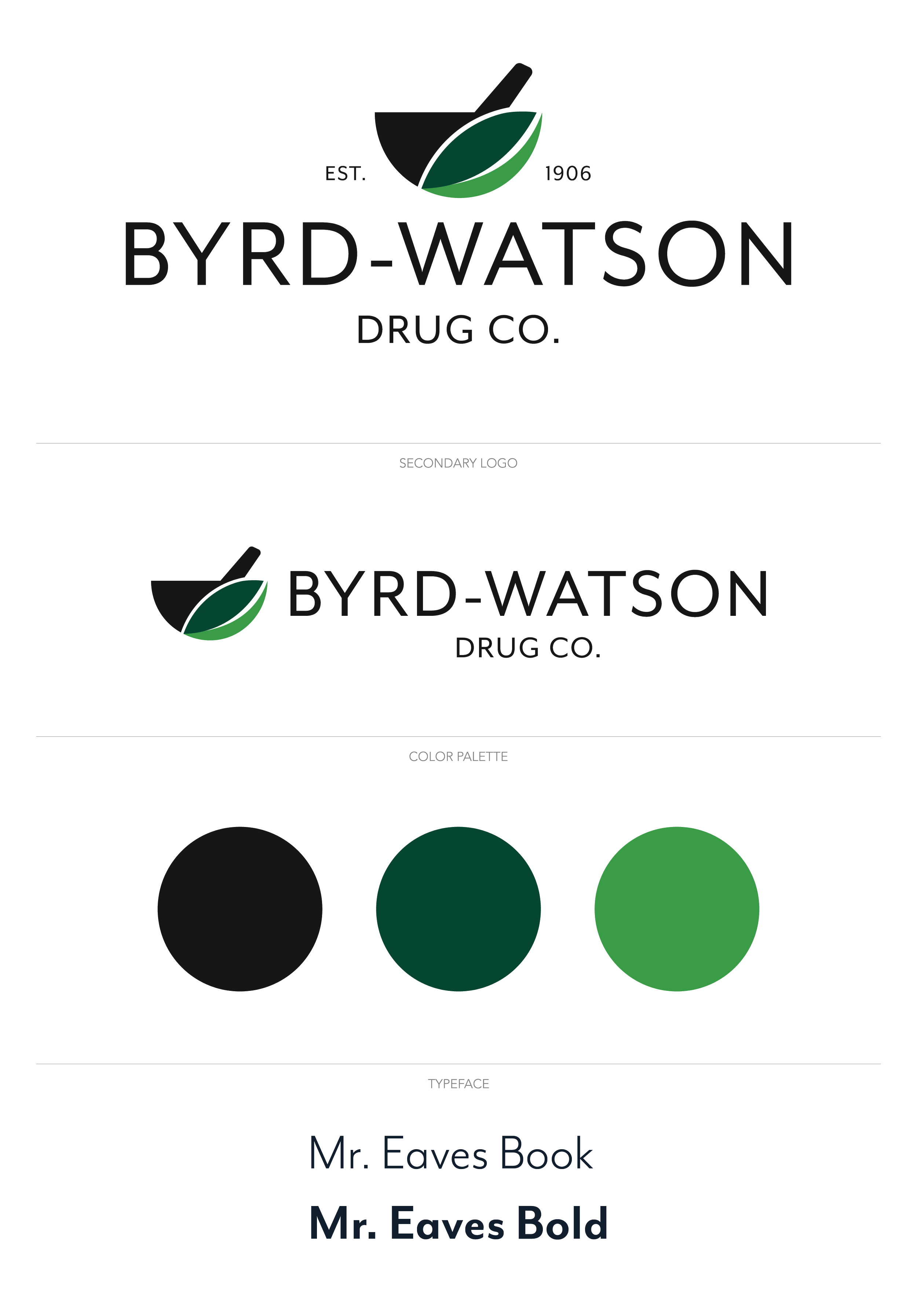
For this project, I designed a logo that merges classic symbolism with natural elements. The mortar and pestle, a traditional symbol of pharmacy, incorporates a leaf into the mortar, emphasizing the pharmacy’s commitment to health and wellness. The green color palette enhances the brand’s focus on nature and trust, creating a welcoming and reliable identity for customers.


